Challenge
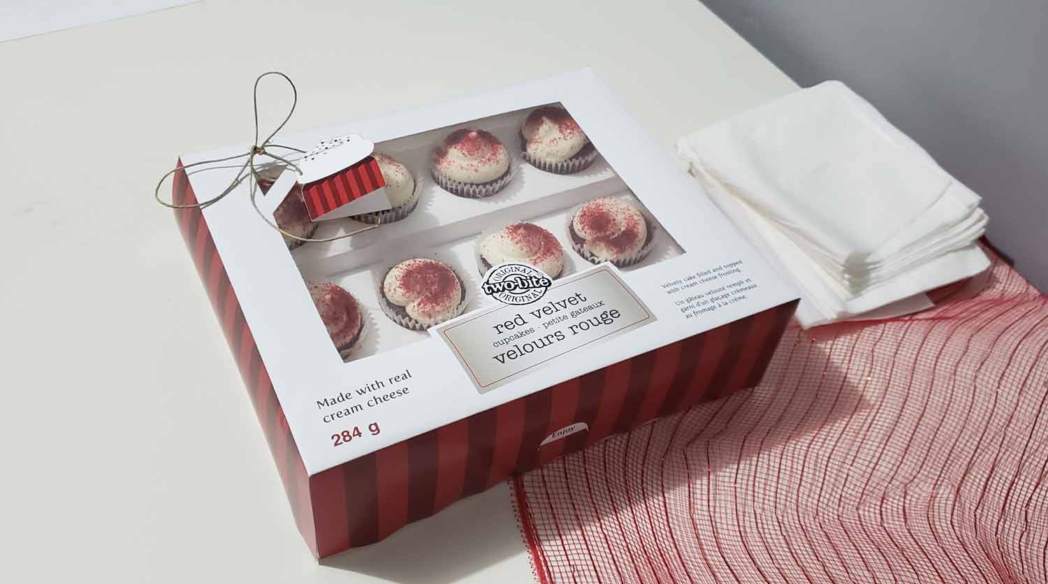
The challenge was to create a package redesign for an existing brand that uses excessive plastic material for their product. The ultimate goal is to design a more eco-friendly package by replacing all or reducing the amount of plastic.
Research
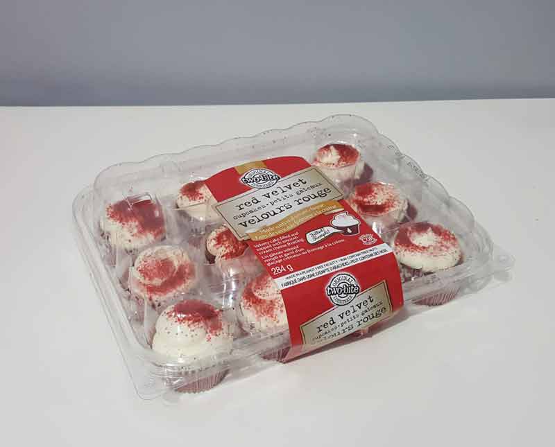
Two-Bite is a company known for its unique, bite sized baked goodies sold in grocery stores. They are mostly famous for their delicious brownies and cupcakes. Their red velvet flavoured cupcakes is the main focus of this project. Their aim is to bring groups of people together with their delicious mini cupcakes. The problem with their original packaging is that it is made entirely of plastic. We can find alternate materials that will be more environmentally friendly.
Current Design
Final Product
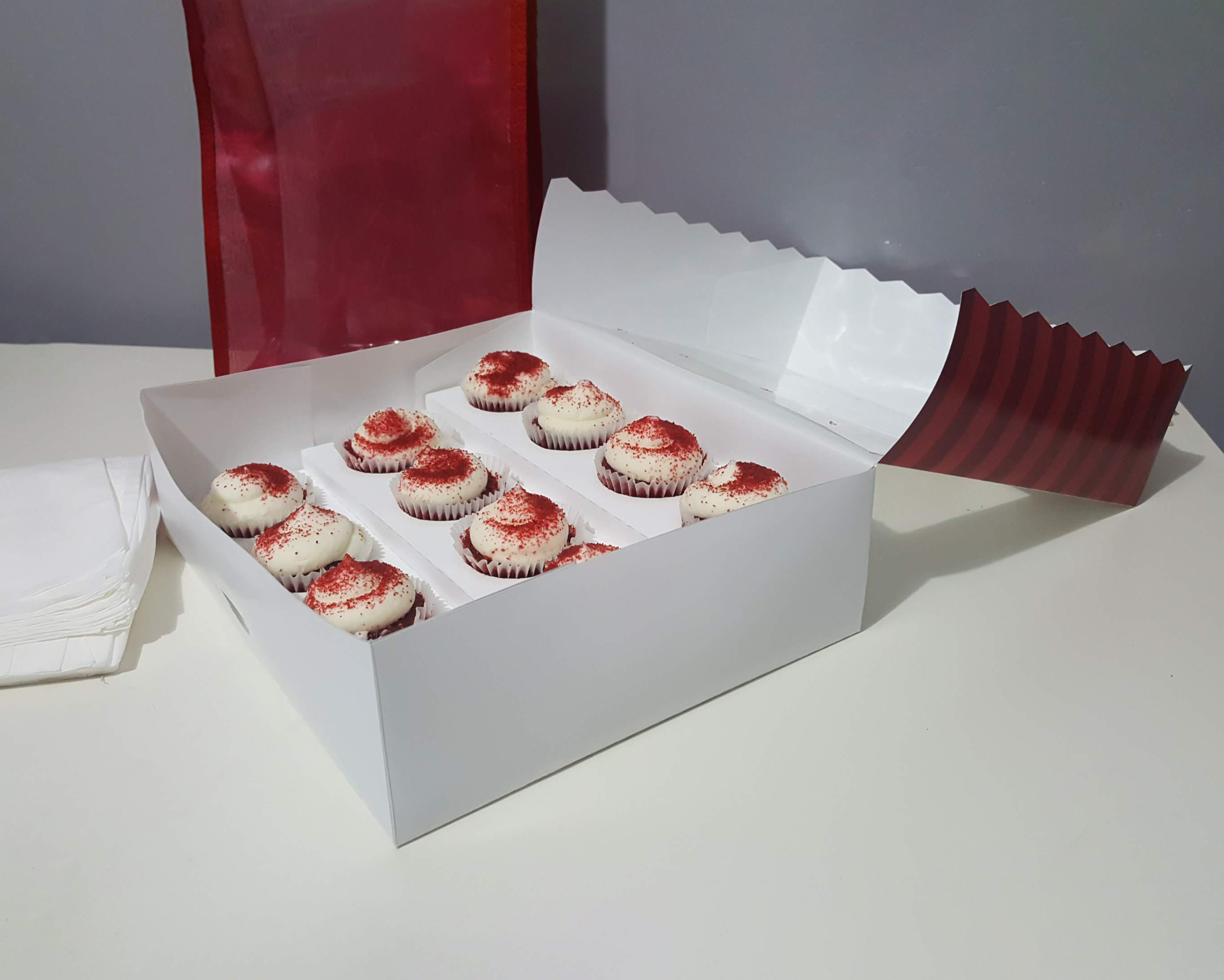
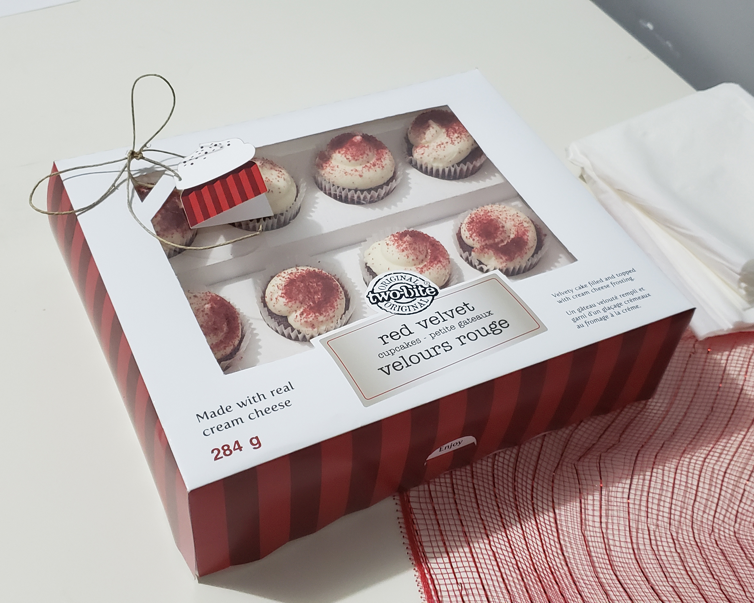
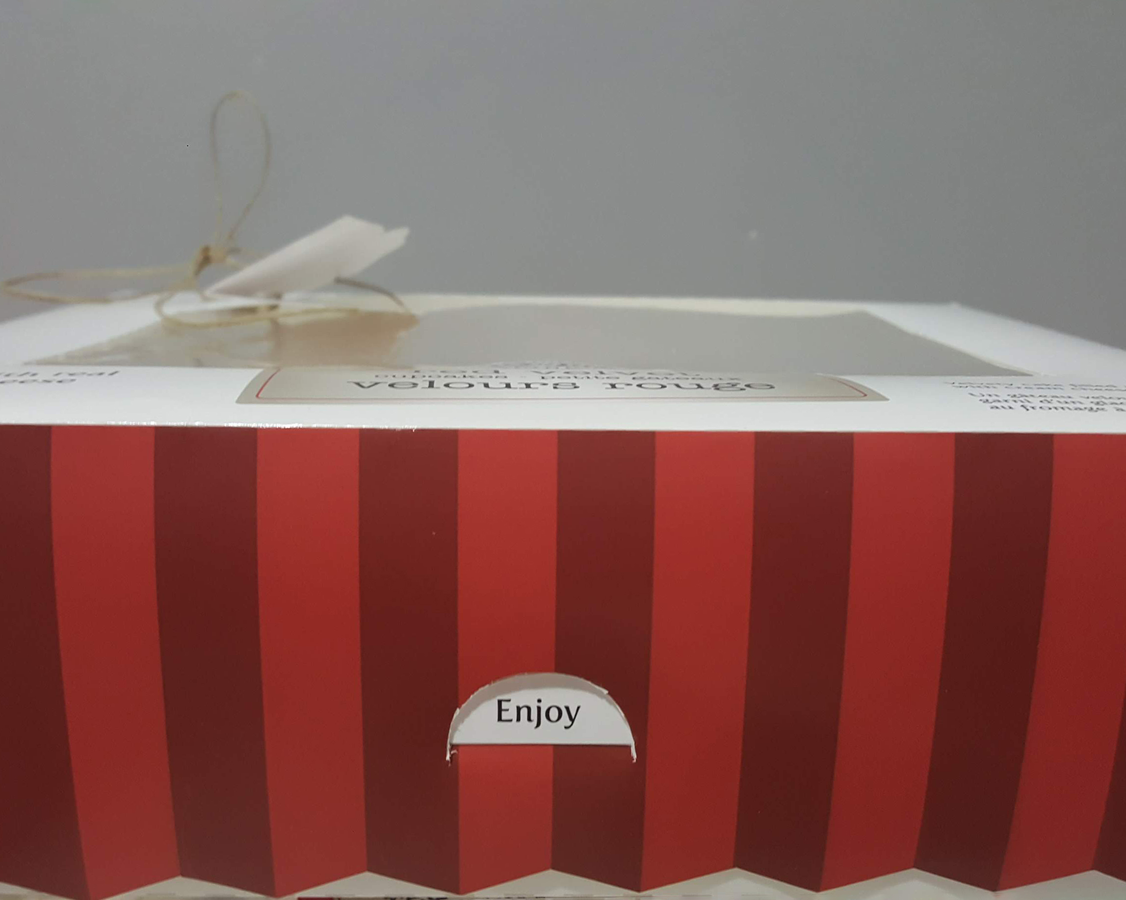
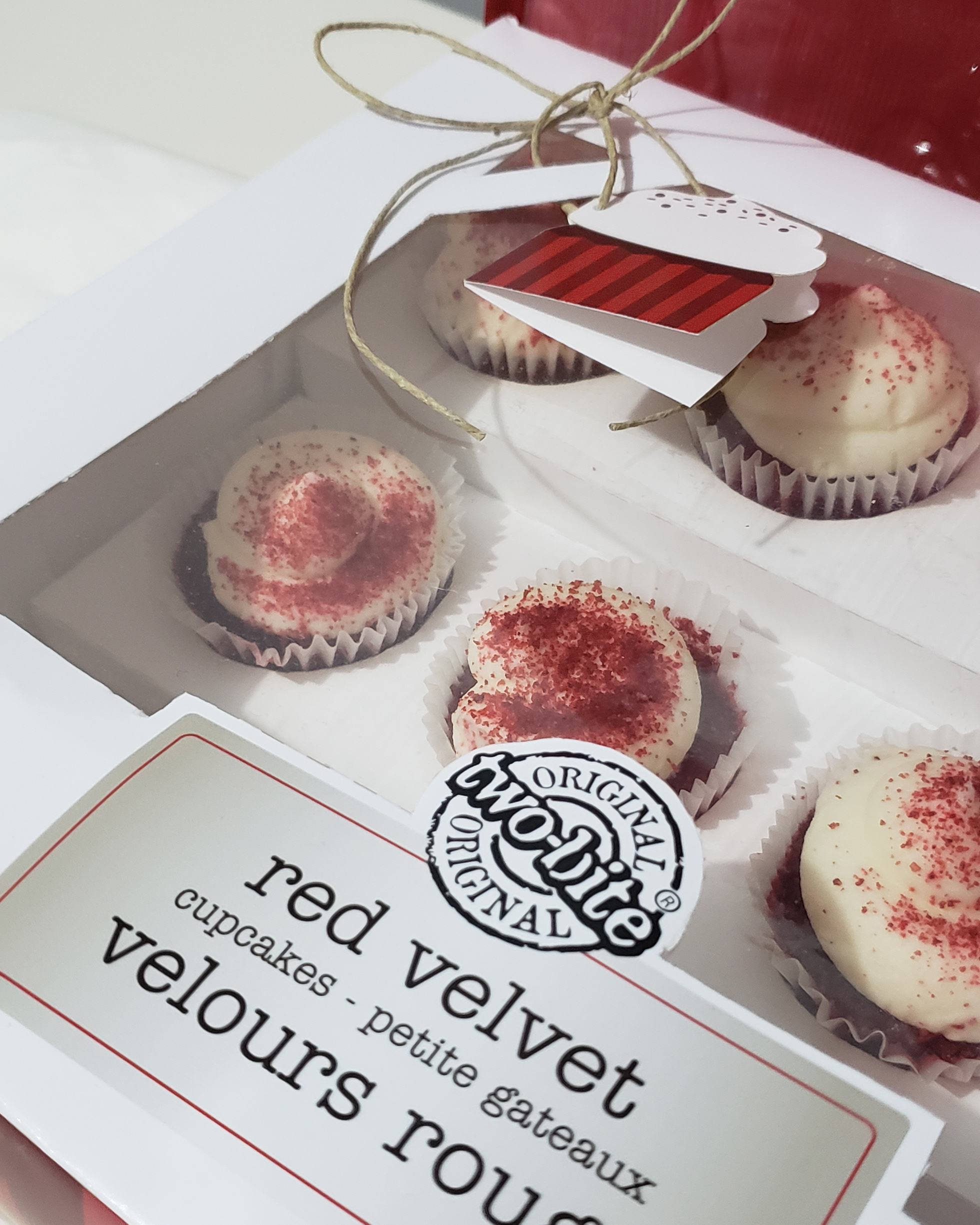
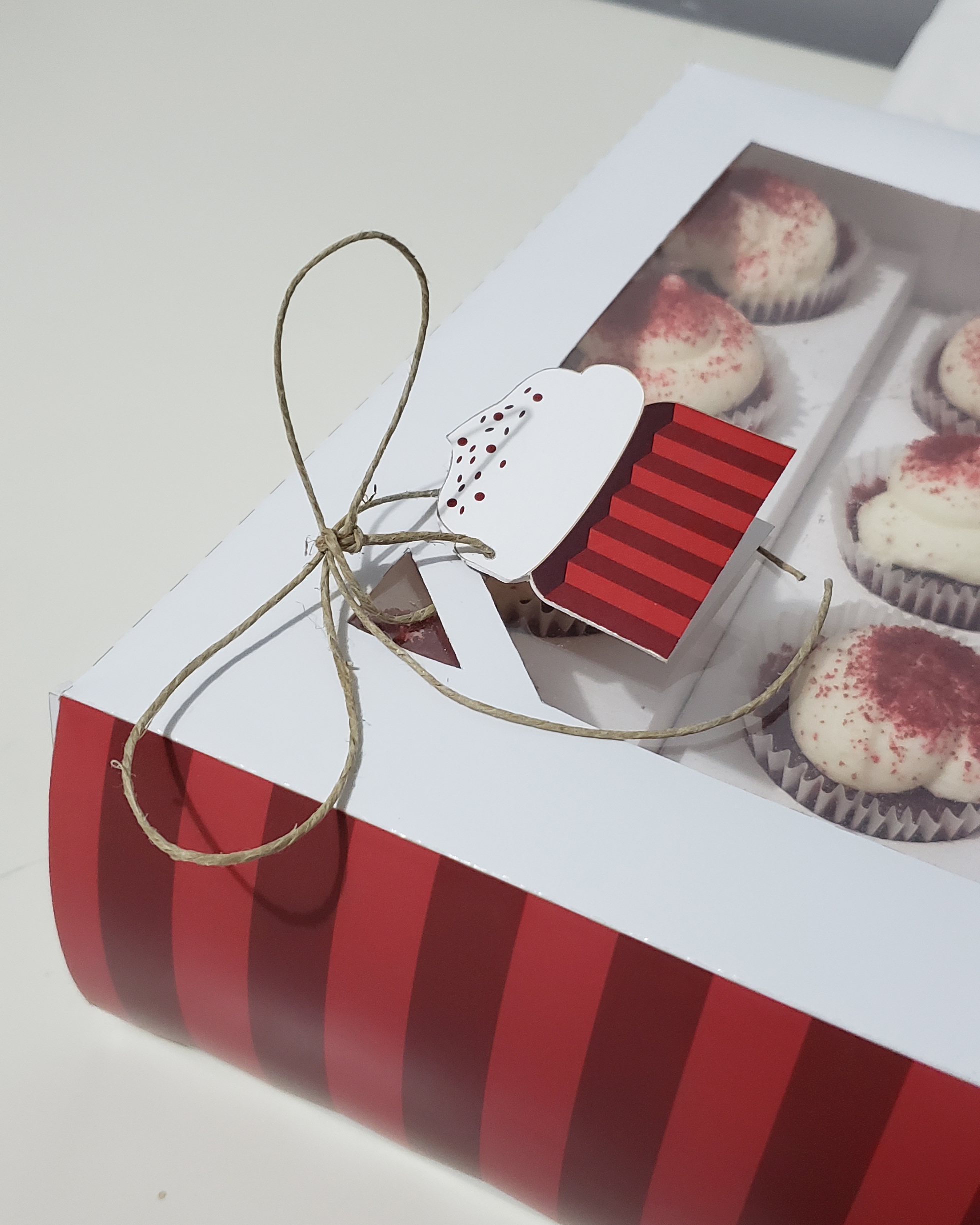
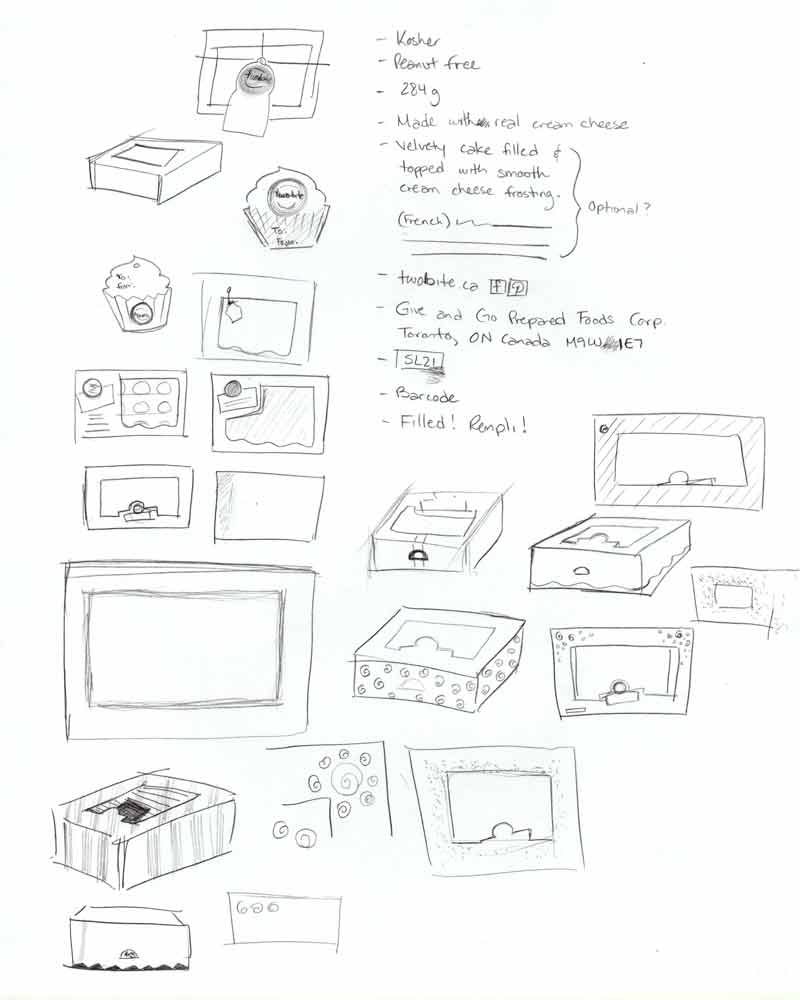
The plastic was replaced with thin cardboard paper for the final design. It is important for consumers to see the state of the cupcakes since they are quite delicate. No one wants to be disappointed to see smushed frosting when they open the box. The box is made of cardboard while the top section is thin recyclable plastic. In addition, the simple box structure makes it easy to stack on shelves or tables.
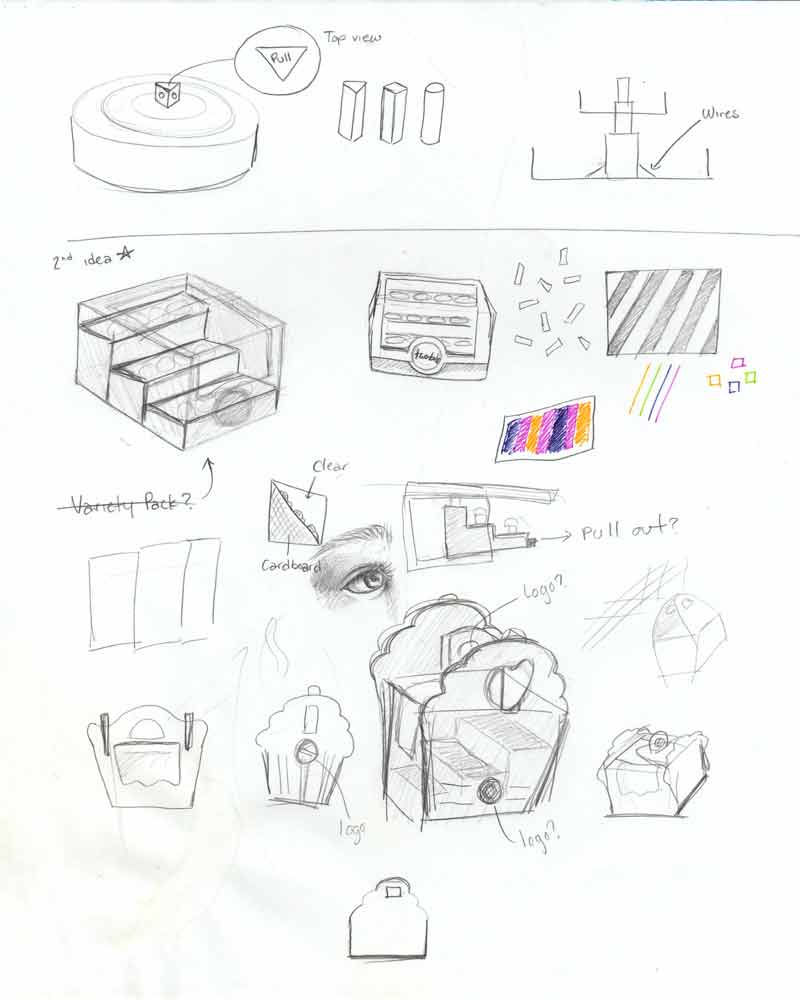
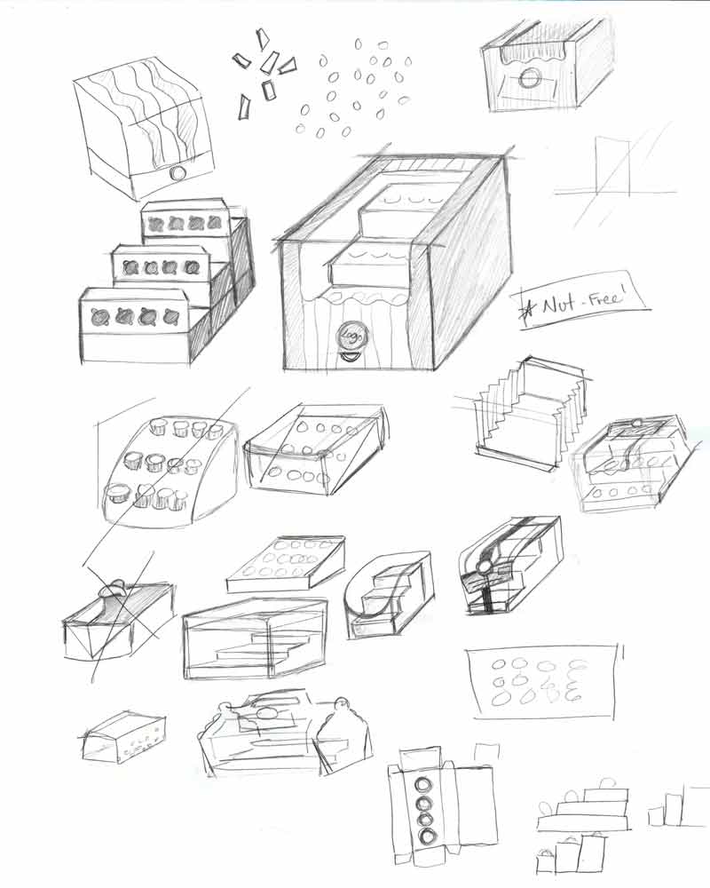
Gifting is the new concept of this design. The colour palette was kept the same because they complement the flavour and theme. Along the sides of the box cover are rigid edges with alternating red shades to represent the texture of a cupcake cup. Already, this stands out against its competitors. Its interior structure holds all twelve cupcakes is in a fun staircase display. It leaves finger space, making it easier to pick one up. As a second element, a tag in the shape of a cute tag was added with a hemp cord to finish the package design.
Overall, it was a great challenge working on containing 12 objects.
Process
