The challenge was to redesign a logo for a local company. I chose a massage therapy clinic known as Kneaded Touch.
Kneaded Touch is an Ottawa, Canada based business with three locations: Merivale, Barrhaven and Westboro. Their goal is to fix and relieve their client’s chronic pain with massage therapy. The overall appearance and construction of their current logo was far too generic for its competitive market. It includes 2 different serif fonts, 3 colours with gradients and a graphic of a sprout. One important note, is that it becomes illegible in reduced sizes. Next, is colour choice. Kneaded Touch uses green which is used by most of its competitors. The gradients applied to the rest of the colour palette, cause more difficulty in legibility for reduced sizes.

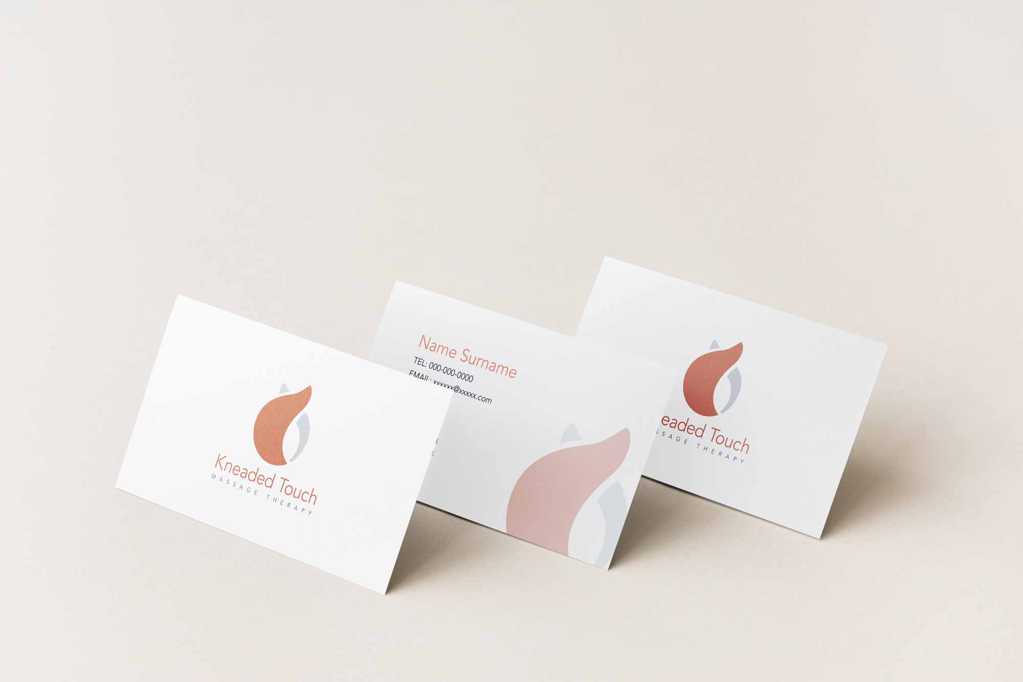
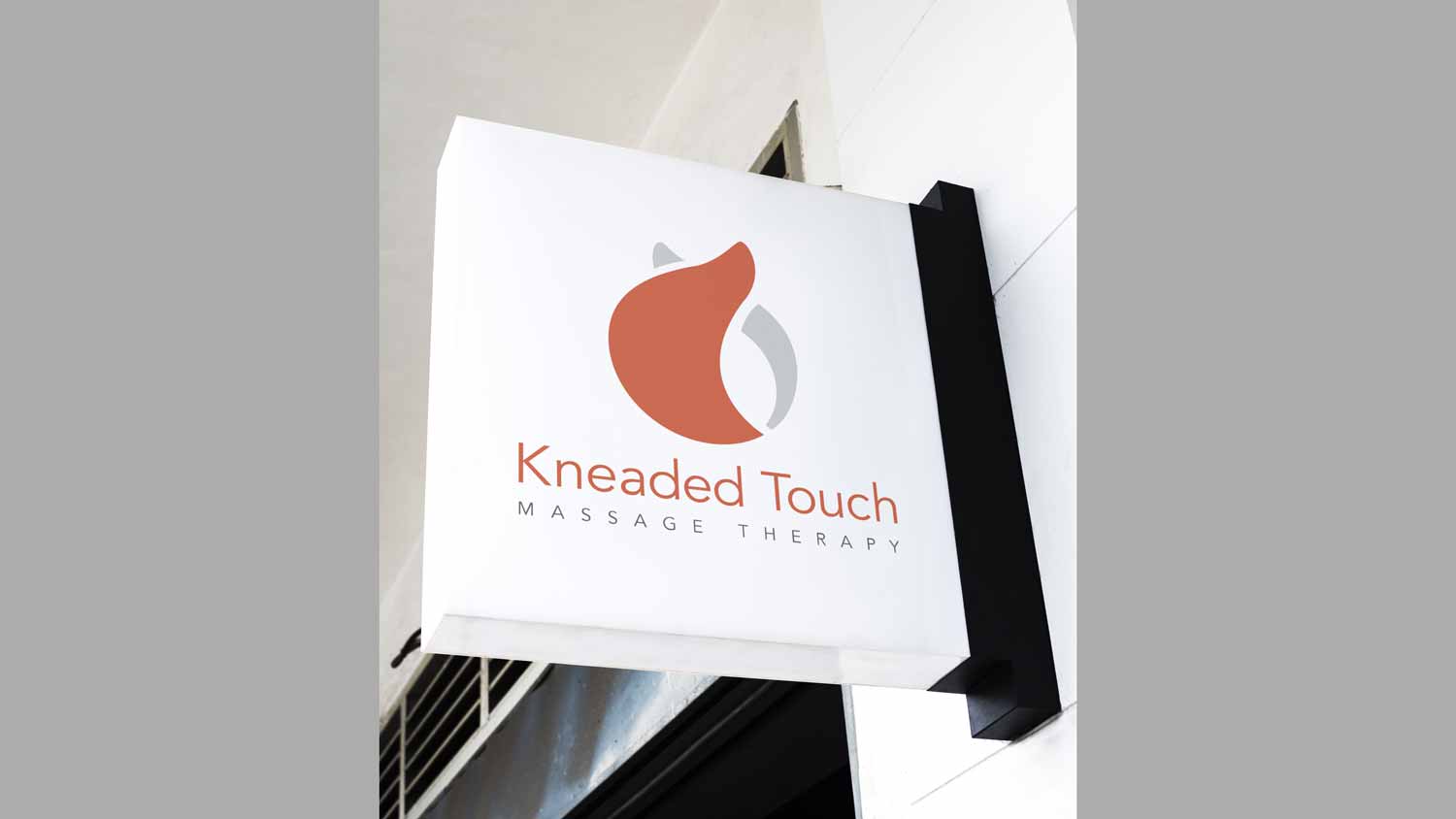
This is the final revision of the preferred identity for Kneaded Touch. It consists of a simple graphic as well as the company name and subhead. The two curved tops of the graphic represent the shape of two thumbs as well as the motion of how a masseuse would massage someone’s back. The soft orange/red colour with the grey executes a feeling of strength and relief. The simplistic logo design is now legible in smaller scales.